Chapter 5: Time, Space, and the Hex
Turn length and hex size are the time and space of the wargame world. If scale determines what your game is about, these two decisions set the physical and temporal dimensions your simulation operates in. They are tied to scale, and you cannot discuss one without the other, but they deserve their own treatment because the choices you make here ripple through every other system in your game, from movement rates to combat resolution to stacking.
What a Hex Actually Represents
New designers assume that all the units in a hex are sitting inside the area that hex represents. A natural assumption, and wrong at every scale above tactical.
A counter in a hex represents the operational intent of a unit more than the unit itself. A division counter on an operational map does not mean every soldier, vehicle, and supply truck belonging to that division is crammed into a twenty-kilometer circle. The division’s center of gravity is there. Its commander’s attention is focused on that area. Its combat power projects from that general vicinity. The actual troops might be spread across several hexes worth of real terrain. Kevin Zucker’s Library of Napoleonic Battles works this way. The hex scale maps to the frontage of a single brigade, around 500 meters, and a single brigade in a hex makes physical sense. But when you stack multiple brigades in the same hex, with corps-level officers increasing stacking limits, those formations are not all occupying the same 500 meters of frontage. Some are in reserve, some are behind the line, some are waiting to rotate forward. The hex represents where those formations are committed, not where every man is standing.
You could argue that a hex should represent the relative frontage of the units in the simulation. There is some logic to this. If a division in your war held a front of about fifteen kilometers, then a hex scale of fifteen kilometers means one division per hex lines up with historical force density. I find this approach limiting, and only useful for tactical simulations where the physical space a unit occupies relative to its neighbors affects gameplay directly: fields of fire, mutual support, enfilade. At higher scales, a more abstract interpretation of what it means for a unit to be in a hex gives you more design flexibility and produces games that better capture the feel of operations and strategy.
This distinction affects how you think about stacking, zones of control, and movement. If you treat a hex as a literal container, you will design stacking limits based on how many units fit. If you understand that a hex represents operational space, you can design stacking from a more useful angle.
Stacking as Command Capacity
Stacking limits express command capacity more than physical space. A stacking limit of three says a commander at this level can coordinate three formations in the same operational area.
In Imperial Bayonets, stacking follows organizational structure. Two combat units of any type can stack together. Three units of the same division can stack together. Five units of the same corps can stack together, but only if a leader is present. The progression tracks the chain of command: more organizational overhead on-site means more formations you can coordinate. A corps commander stacked with his units enables tighter concentration of force than an ad hoc grouping of battalions from different divisions trying to operate without unified leadership.
This models something real. You could always shove more men into a valley. The constraint on force concentration in most periods was the ability to command them coherently. Stacking limits built around command capacity force decisions about where to place leaders, which formations to group together, and whether concentration is worth the risk. Physical-space stacking limits just create a puzzle about fitting counters into hexes.
Choosing Your Hex Scale
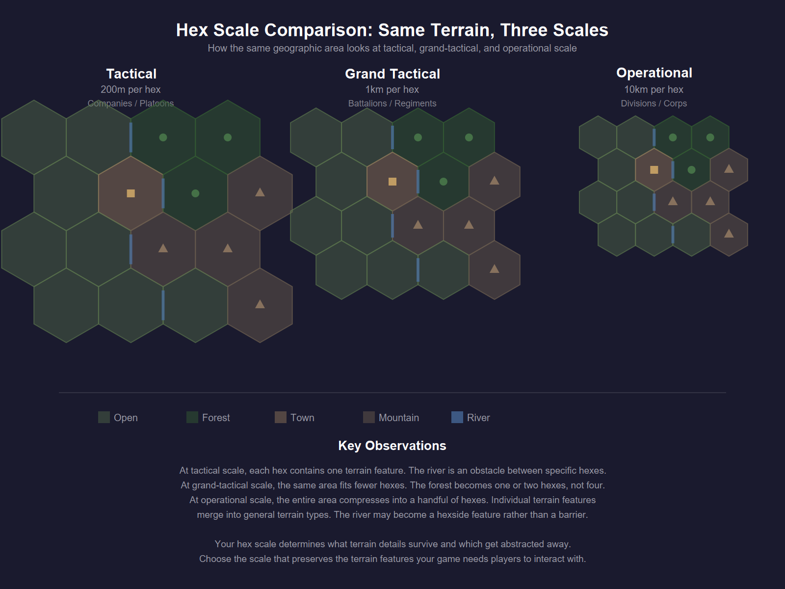
No formula exists for choosing the right hex scale, and I would be suspicious of anyone who claimed otherwise. Start from a reference map that looks right. This comes with experience.
I usually have a mental picture of what units on a map will look like in the simulation before I settle on a hex scale. I know how many counters I want, what level of unit I am representing, and how much of the theater needs to be on the map. The hex scale falls out of those constraints more than it drives them.
For Sedan 1940, each hex is one kilometer. That works for a grand-tactical battle where I am representing squadrons, battalions, and regiments over a confined area with two-hour daytime turns. For Imperial Bayonets, hexes are 500 to 700 meters, a tighter zoom for the post-Napoleonic battles in the series where formation frontages and artillery ranges need finer resolution. For an operational game in the Procedural Combat Series, hexes cover ten to fifty kilometers because I am tracking divisions and corps across a whole theater over weeks.
The hex scale should serve the simulation. Give yourself enough resolution to make terrain features and force dispositions matter without burying the map in empty hexes. If you are designing your first game, pick a hex scale that works for your unit scale and map area, play a few turns, and adjust if it feels wrong. You will know. Units will bunch up where they should not, or terrain that should matter will be too small to register, or the map will stretch across the table with vast dead zones where nothing happens.
Turn Length
Turn length is tied to scale, and the relationship is straightforward. Tactical and grand-tactical games deal in minutes to hours. Operational games cover days or weeks per turn. Strategic games measure turns in months or seasons.
Turn length is less agonizing than hex scale because it functions as a sanity check against your other systems. Units should not move further in one turn than they could have moved in real life at the game’s chosen time scale. If your operational game has weekly turns and a division can march from one end of France to the other in a single turn, something is broken. If your tactical game has ten-minute turns and an infantry platoon can sprint three kilometers, your movement rates are wrong.
In Sedan 1940, daytime turns are two hours and nighttime turns are four hours, twenty turns total. Those numbers come from the pace of the actual battle: how fast German armor moved, how fast the French could react, how long the critical engagements lasted. For Imperial Bayonets, one-hour turns match the tempo of post-Napoleonic battle, where formations took time to deploy, artillery preparation preceded assaults, and a corps attack developed over the course of a morning. One hour is also about the average time it took for an order dispatched on foot or horseback to reach a subordinate commander in that era. The turn length ties to the command system: each turn represents one decision cycle, the time between a commander issuing an order and that order taking effect on the field.
Turn length and hex scale together create the physics of your simulation. They determine how far a unit moves per turn, which shapes how the map plays, which shapes what options the players have. Get them close and the rest of the game has a solid foundation. Get them wrong and no amount of clever mechanics will fix the feel.
Hex Maps, Point-to-Point, and Area Control
Hex maps became the standard in wargaming for good reasons. They provide uniform movement costs, consistent adjacency, and a grid that handles directional movement well. For conflicts with defined front lines and forces that maneuver across continuous geography, hexes work.
They are not always the right choice.
For a while I had an idea for a hex-based simulation of the Peloponnesian War. I studied the conflict, started working on a design, and realized too late that hexes could not represent the dynamics of that war. There were no front lines of the kind common to modern combat. Armies marched to a location, fought a battle on flat, mostly clear land, and marched home. The geography that mattered was not terrain in the wargame sense, not hills and rivers and forests, but the political and economic connections between city-states, the naval routes that controlled trade and troop movement, the alliances that shifted over decades. A hex map failed to produce interesting choices, let alone relevant ones, compared to an area map or point-to-point design.
I got midway through the design before this clicked. I had already paid for a map and a set of cards for the prototype. The game never got published, though I hope to finish it someday. I had the map redone in an area control style. This is the kind of mistake you make when you are inexperienced: committing resources before the research tells you what the design needs. Chapter 3 again. Do your research before you commit to mechanical frameworks, because changing your mind later costs real money. In my case, somewhere between five and six hundred dollars for a map I could not use.
The Thirty Years War is another conflict poorly suited to hex maps. Decentralized warfare across a vast theater, no continuous front lines, forces operating across disconnected regions.
Point-to-point and area movement games are mechanically almost identical but look nothing alike. Both abstract geography into nodes connected by paths rather than a continuous grid. Point-to-point uses dots and lines; area movement uses bounded regions. The choice between them is aesthetic and depends on what visual language best communicates your game’s geography to the player.
Both are associated with strategic games, but plenty of smaller-scale designs use area movement well. Two of my own games use point-to-point. The Great Northern War covers Charles XII’s campaigns across the Baltic and Scandinavia, where the conflict moved between cities and political centers rather than across continuous terrain. Prigozhin’s March of Justice follows the Wagner mutiny along a single highway corridor from Rostov to Moscow. In both cases, hexes would have imposed spatial detail that did not match how the conflicts worked. The advantage of point-to-point is that you define the geography that matters rather than imposing a uniform grid. The disadvantage is that you lose granularity. Flanking, encirclement, and detailed maneuver are harder to model on a point-to-point map.
The choice between hex, area, and point-to-point comes down to designer preference, informed by what the conflict demands. Study your subject. If front lines, terrain, and spatial maneuver are central to your thesis, hexes are probably right. If the conflict is about connections, logistics, and the political geography of a war, consider the alternatives.
Making a Playtest Map
Making a playtest map is easier than most people imagine. I have seen designers stall out here, convinced they need a polished map before they can start testing. You do not. A functional playtest map can be ugly. It needs to be readable.
Find a historical map close to your game’s scale. Download GIMP, which is free. Open the historical map, create a new layer on top of it, and trace over the relevant features: coastlines, rivers, cities, major terrain. Put a background layer underneath everything and dim the original map so your traced lines are visible. Draw terrain features on their own layers. For a hex map, overlay a hex grid. GIMP has plugins for this, or you can find hex grid templates online.
At a minimum, color in hexes to note their terrain type. Green for woods, brown for rough, blue for rivers, white for clear. That is enough to start pushing cardboard and finding out if the game works. Prettying things up helps make playtesting more pleasant, but do not let map aesthetics slow down the design process. I am plenty guilty of spending too much time on playtest maps. I enjoy the cartography side of design, so I tend to work on the map before I finish rules. That keeps the process engaging for me, but it is not necessary and it is not where the real design work happens.
Point-to-point and area maps are even easier to prototype. You do not need to make judgment calls about which hexsides to align rivers with, or whether rivers run along hexsides or through the middle of hexes, a choice less common in modern games but still relevant. You draw dots and lines, or draw regions and connect them.
Other published game maps are acceptable resources for inspiration. You could test an idea using a map from another game that covers similar geography at a similar scale. The point is to get something on the table that lets you test the systems you are building. Design the map during playtesting to figure out what works and what does not. Visual polish, cartographic accuracy, graphic design: those come later.
From Playtest Map to Published Map
Once your design is finished and tested, you will want a professional map for publication. Unless you are a trained cartographic artist, this means hiring someone.
Find an artist who knows wargame cartography. This matters more than general artistic talent. For We Were Not Cowards, I hired Alyssa Faden, an RPG map artist. Talented, gorgeous work. The problem was that terrain did not conform to hexsides or hex spines, which created multiple elevations in a single hex. Some publishers handle this fine. Multi-Man Publishing games frequently have mixed terrain in a single hex and resolve it by having the player use the worst terrain type for movement or combat purposes. But for my game, where movement costs and ranged artillery calculations were central, mixed terrain in a hex made things too unwieldy. I had to have the entire map redone.
For most of my published games, Ilya Kudriashov has done the cartography. He understands wargame maps. He knows that the map is a playing surface first and a piece of art second. His maps are both functional and professional.
Be prepared to spend several hundred dollars for a finished map. You can bundle map work with counter graphics or box art to get a better rate. The main point: do not invest in professional art until your design is done. Get the game working on an ugly map first. Make your mistakes cheap. The Peloponnesian War map I paid for and could not use taught me that the expensive way.
Some maps come together without trouble. The map for 1914: East Prussia: The World Undone, done by Ilya in a classic SPI style, fit the scale and the conflict. The geography of East Prussia cooperated with the hex grid. Rivers ran where hexsides fell. The terrain was distinct enough to create interesting gameplay without agonizing over hex placement. When the map works with the conflict, the process is painless. When it does not, you cannot force it.
Case Study: We Were Not Cowards and The World Undone
These two games sit at opposite ends of the map experience.
Imperial Bayonets — We Were Not Cowards: Sedan 1870 is a grand-tactical game with the fine resolution that scale demands. Every hex matters. Elevation changes, river crossings, and terrain types all affect combat and movement. The first map, though artistically accomplished, did not conform terrain to hex boundaries. A hex with two different elevation levels forced players to guess which one applied. Terrain that straddled a hexside left the rules unable to resolve what happened. A beautiful map that produces ambiguous game states is worse than an ugly map that plays without confusion, because ambiguity breeds arguments and arguments kill playtesting sessions. Ilya Kudriashov redid the entire map.
1914: East Prussia was the opposite experience. Ilya did the map in a classic SPI aesthetic. The lakes, forests, and road networks of East Prussia mapped onto a hex grid without friction. The scale fit the conflict, the geography cooperated with the format. No ambiguity, no redos, no arguments during playtesting about what a hex contained.
Some conflicts are easier to map than others. But the larger point is that a map is a game component, not an illustration. Design it to serve the game. Test it to find ambiguity. Fix the ambiguity before you pay for art. And when you do pay for art, hire someone who understands that a wargame map has to work before it can look good.
Physical Systems Design: The Simonsen Legacy
Everything I have said in this chapter about maps as functional tools rather than illustrations, about terrain conforming to hex geometry, about the map serving the game before it serves the eye, traces back to one person. Redmond Simonsen was the art director of SPI from 1969 to 1982, a professionally trained graphic designer (BFA from Cooper Union), and the reason wargame maps look the way they do. His full biography appears in Appendix E. What matters here is his design philosophy.
The term he coined for his approach was physical systems design, which he defined as the graphic engineering of game elements. The concept sounds simple. Every visual element in a wargame exists to make the game easier to play and the game state easier to read. The map, the counters, the player aid charts, the rulebook layout: these are not separate aesthetic concerns. They are a single integrated system, and the graphic designer’s job is to engineer that system so the components serve gameplay.
Simonsen’s argument about constraints is the part most relevant to working designers. He maintained that the physical components available to you, paper maps, cardboard counters, printed charts, are the single greatest limiting factor on what a game can do. Designers generate ideas faster than the physical medium can keep up. The graphic designer’s job is to push those material limits, finding new ways to encode more information into the same paper and cardboard so the components do not become the bottleneck.
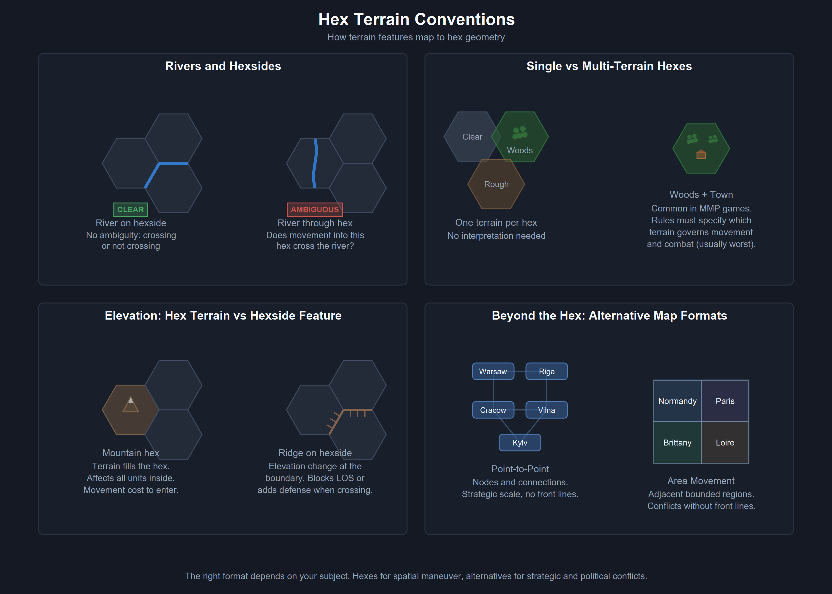
This plays out in specific choices that became universal standards. Rivers conforming to hexsides. Simonsen reintroduced this technique, which had been used in Avalon Hill’s D-Day and then abandoned, and made it the permanent convention. Before this was standard, rivers could run through the middle of hexes, creating ambiguity about which hexes they affected. Forcing rivers onto hexsides eliminates that ambiguity. You are either crossing a river hexside or you are not. The mechanical payoff is direct: movement costs, combat modifiers, and supply tracing all work cleanly when terrain features align with the hex geometry the rules reference.
Counter design followed the same philosophy. The PanzerBlitz counter, designed by Simonsen, packed seven pieces of information onto a 5/8-inch square: offensive value, defensive value, range, movement value, unit ID, unit name, and a vehicle or weapon silhouette. Other designers adopted that density as the template. Before Simonsen professionalized counter design, wargame counters were simpler and carried less information. After PanzerBlitz, the expectation was that a counter should tell the player everything they needed to know about a unit at a glance, without referencing a separate chart. Player aid charts themselves became designed components rather than afterthoughts, integrated into the visual system alongside the map and counters.
One of his principles cuts against instinct and is worth remembering. The more complex the game system, the less decorated it should be. Designers who build mechanically dense games often want busy, detailed maps and counters to match the density of their rules. Simonsen’s position was the opposite. As mechanical complexity increases, the visual design must get cleaner and more restrained. A complex game already demands heavy cognitive load from the player. Adding visual complexity on top of mechanical complexity makes both harder to process. Clean graphics on a complex game let the player focus on the decisions the designer built. Busy graphics on a complex game compete with the decisions for the player’s attention.
The cumulative effect of Simonsen’s work across over 400 titles at SPI is that the visual grammar of wargaming was established by one person over thirteen years. Hex maps with terrain conforming to hex geometry. Information-dense counters with standardized layouts. Player aids as integral components. These are things we take for granted because Simonsen made them standard. He was doing user interface design decades before that term existed in the software industry.
Simonsen laid out his philosophy in a chapter called “Graphics and Physical Systems Design” in the 1977 book Wargame Design, which also featured contributions from Dunnigan and other SPI staff. Kevin Zucker wrote a companion piece called “The Limits of Art” in Fire & Movement magazine in 1978 that explores the same ideas from a slightly different angle. Both are worth reading if you are designing your first map, or your tenth. The principles have not aged. The materials have changed, print-on-demand and digital prototyping have replaced the production constraints Simonsen worked under, but his core insight holds. The physical components of your game are a system. Design them as a system. Engineer them so they serve the game rather than decorating it.